Page 3 of 4

Re: Abrax Skins v.1.0 (26.09.11)

Posted: Mon Oct 03, 2011 4:53 pm
by CoachUK
@Pman...Thanks for your comments.
Pman wrote:1. Im not sure if youve included a mute button or not, but i cant find one. Maybe consider making the left volume icon a mute button.
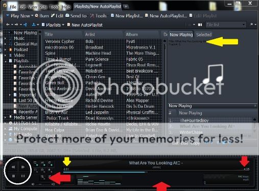
I did include a mute function by clicking on the 'low volume' icon. This works in all other variations of Abrax except SP/SPCS (although it does work in the FloatPlayer). Reason being I forgot that I shifted the location of the volume bar (If you click on the S of SP you'll find where I put it :roll: . I've modified this and a revised version is available from the download link.
Pman wrote:2. For the buttons on the player, you could make a highlight button, similar to the BitmapPressed button but with the blue flashing blob replaced with a different colour like white/greyish. Would make it look polished.
A matter of personal preference. If you use a genuine LED switch it doesn't change to a mid-colour when you hover your finger over it. It's either on or off. However, I have no objection to your suggestion and I'll consider that for a future update.
Pman wrote:3. If you have a genre that's quite long, ive noticed that the end of it gets cut off. You dont have to worry about this as such as there's hardly any genres that are big enough to be cut off.
The genre field is set to non-scrolling so any excess length will be cropped....as you say, doesn't happen often.
Pman wrote:4. The black line under the Art&Details tabs looks weird, you could remove it ([PageControl] CoverWindowTabsLineUnderTabs=0 works i think).
I've watched the comments about this line over the past few months in various skin posts and personally, it really doesn't matter to me if it's there or not. Again a personal preference. However, as I've updated the skin files for the errant 'mute' button I've also hidden the line for the sake of peace and harmony. :wink:
Pman wrote:5. Lastly there's two black pixels on the + sign for main tabs. From far out it looks like the + sign is half missing.
On this one I'll admit I'm stumped. If you look very closely you'll see that it's not random pixels but a slightly offset 'text' plus sign. From whence it comes I know not as it sure as hell isn't in the graphic I use or in any aspect of the theme element. When the 'Oracle' (DreadM) returns from his meanderings I might just see if he can shed any light on this.
Pman wrote:I hope you dont give up on making skins,...
On this one I'm torn at the moment. My business is coming up to the silly season so time will be at a premium and my enthusiasm goes up and down in waves just lately. However, I still have a few things on the boil and I like to see things through to fruition so I hope to get these finished and (if anyone wants them), out there for public consumption.
e.g. Add-in float players to mix-and-match.....The effect/illusion of switchable panels on the player....A theme that has a massive player for those that want to see it from the other side of the room....and my current 'baby'..."miniMus" which has an absolute minute player for the main theme which also doubles as the float player....
(actual size)
Image

So there's still a little life in the (very) old dog yet.

Re: Abrax Skins v.1.0 (26.09.11)

Posted: Mon Oct 03, 2011 6:13 pm
by Pman
Thanks a lot Coach, yeh i just found the mute button hidden away among the S.
A matter of personal preference. If you use a genuine LED switch it doesn't change to a mid-colour when you hover your finger over it. It's either on or off.
You do have a point there about the LED buttons, either on or off...silly me!
I've watched the comments about this line over the past few months in various skin posts and personally, it really doesn't matter to me if it's there or not. Again a personal preference. However, as I've updated the skin files for the errant 'mute' button I've also hidden the line for the sake of peace and harmony. :wink:
I think with the black line, im probably one who really doesnt like it, but it does depend on the skins and the tab style, i know of a couple of skins that work with the black line mainly because the skins are very dark themselves.
On this one I'll admit I'm stumped. If you look very closely you'll see that it's not random pixels but a slightly offset 'text' plus sign. From whence it comes I know not as it sure as hell isn't in the graphic I use or in any aspect of the theme element. When the 'Oracle' (DreadM) returns from his meanderings I might just see if he can shed any light on this.
Oh yeh i just noticed its a text + sign half overlapped, thats a bit strange. I noticed DreadM uses an empty tiled buttonobject called "New" straight underneath the NewTab and he makes it equivalent size to a + sign...maybe that might work.
Haha, DreadM the "Oracle"....in my eyes, yourself, DreadM, nohitter, Eyal and many others are all Oracles, youre all talented in your own different way! :wink:
On this one I'm torn at the moment. My business is coming up to the silly season so time will be at a premium and my enthusiasm goes up and down in waves just lately. However, I still have a few things on the boil and I like to see things through to fruition so I hope to get these finished and (if anyone wants them), out there for public consumption.
e.g. Add-in float players to mix-and-match.....The effect/illusion of switchable panels on the player....A theme that has a massive player for those that want to see it from the other side of the room....and my current 'baby'..."miniMus" which has an absolute minute player for the main theme which also doubles as the float player....
Yeh it can be hard when work is taking over and especially coming up to xmas it gets mighty busy. But its nice to have something there to fall back on and youre still inventing new things and keeping yourself active which is a good thing....and youre still going, switchable panels?!...Now that would be impressive if you could do something like that, and a big player which i know would come in handy with me as i have my pc on the other end of the room on its own seperate desk, and your mini player looks very nice, its all-in-one look with all the controls to ready just looks snazzy. 8)

Old?...Its like saying Alex Ferguson is old, but when he's winning the league constantly and outdoing everyone, it goes to show age shouldnt ever slow you down!

Re: Abrax Skins v.1.0 (26.09.11)

Posted: Tue Oct 04, 2011 11:41 pm
by rrfpacker
I must be blind, Where is the mute button?

Re: Abrax Skins v.1.0 (26.09.11)

Posted: Wed Oct 05, 2011 2:27 pm
by CoachUK
rrfpacker wrote:I must be blind, Where is the mute button?
Click on the low volume icon (left side of volume bar).

Re: Abrax Skins v.1.0 (26.09.11)

Posted: Wed Oct 05, 2011 11:42 pm
by rrfpacker
I read that in a previous post and have tried it without success. I see it doesn't work on the SP skin, but I can't get it to work on any, even the Xtreme. Even the modification you posted. Weird.

Re: Abrax Skins v.1.0 (26.09.11)

Posted: Wed Nov 02, 2011 8:32 pm
by rrfpacker
Hey Coach,

Has your crazy season slowed down? Are you considering my request to make the player of this skin more like the blue of the theme? I know you liked the contrast, but wondering if you'd thought about it.

Re: Abrax Skins v.1.0 (26.09.11)

Posted: Sun Apr 15, 2012 10:43 pm
by rrfpacker
Coach, still wondering??

Re: Abrax Skins v.1.0 (26.09.11)

Posted: Fri May 11, 2012 10:46 am
by gpzbc
I just discovered this theme. Thank you!!

Re: Abrax Skins v.1.0 (26.09.11)

Posted: Fri May 11, 2012 10:49 am
by gpzbc
So far, the AbraXtreme is my favorite. Any chance you will make it in a Clean Screen version?

Re: Abrax Skins v.1.0 (26.09.11)

Posted: Thu Jun 21, 2012 12:45 pm
by Styphelus
I can't get the MonkeyRok skin to work. The background shows up but all album images and information are missing. Has anyone else had this issue?

Re: Abrax Skins v.1.0 (26.09.11)

Posted: Sat Jun 23, 2012 5:42 pm
by CoachUK
Apologies for not replying to people sooner...back now after an 8 month break from MM (well, sort of...)

@Styphelus - Seems to be working fine here.

@gpzbc - Glad you like it. Maybe a clean screen version in the future but don't hold your breath :wink:

@rrfpacker - I have considered your request and I will try and get to it but it's not going to be a matter of priority (sorry :( ). Time's still at a premium here and I'm having to fit in bits of MM skinning as and when. Latest efforts (which I started 8 months ago and went untouched again until a couple of weeks ago) will be posted soon in Artwork forum.

Re: Abrax Skins v.1.0 (26.09.11)

Posted: Sun Jun 24, 2012 11:16 am
by rrfpacker
CoachUK...Good to have you back, you were missed.

Anything you do for us is above and beyond, take your time. I am giddy with excitement to see what you have for us next. BTW, I had two requests of you, I can't wait to see which one you fulfill!!

Re: Abrax Skins v.1.0 (26.09.11)

Posted: Mon Jun 25, 2012 10:12 pm
by Guest
CoachUK,

I figured it's a problem with skins.htlm. If i replace it with the skins.html file from the "dark" skins.html file that comes with MonkeyRock, the Abrax skin for MonkeyRok works but I get a white border around it. Not sure what's wrong with the Abrax skins.html file but i tried it at work and had a friend of mine try it as well and it doesn't work in any of the 3 systems.

All 3 systems were using Media Monkey 4.05.1496, MonkeyRok 5.6, Windows 7 64bit. I haven't had any issues with any other MonkeyRok skin so far.

Re: Abrax Skins v.1.0 (26.09.11)

Posted: Mon Jun 25, 2012 10:14 pm
by Guest
I meant skin.html, not skins.html - sorry.

Re: Abrax Skins v.1.0 (26.09.11)

Posted: Mon May 20, 2013 8:33 am
by AuralVirus
Best looking skin of all.

Only thing I'd like changed are the play, stop, fwd/rwnd buttons to have the same "glassy" look as the track playing readout (circled in white) and to be larger by placing the 8 smaller playlist on/off, eq, shuffle, continuous playback, auto dj etc buttons (red arrown pointing left) to also be larger by placing them below the track playing read out & in between the eq light readouts (red arrow bottom middle pointing upward) & the star ratings area (2x8 long lay out seems perfect as that space has nothing there atm.)
Is it possible to do this myself without too much hassle?


Also I'd like to actually see the timer, (Yellow & Red Arrows pointing down (should have both been red) as the font in the track info glassy screen readout is far too small (tbh I literally only saw it a second ago when looking harder at what was written and i've been using this skin for 2 or 3 months now) that and the time remaining need to be at least 3 times larger (slightly smaller than the track font itself & the album font could do with being larger) as well as the mp3 bit rate above the ratings stars (red arrow pointing down dar right). Go big.
Can I also edit this myself? (Adjusting the font percentage in skins options seems to change the main font as well which I'd like to stay the same.)
Lastly (whilst on a roll about font sizes.) the font size of the now playing info (right hand side,now playing tab, above top left of the now playing artwork image) is as good as unreadable, that needs doubling.


Image

Other than it's great. (it's great anyway) It's the only skin i use.
Thanks for a great skin.